Wednesday, December 31, 2014

Nathan Fox DLP

One month worth of sleep deprivation and banging my head over a medium that was very new to me, and here is the result! This is the final culmination of Nathan Fox's distance learning program, posted, uh, a couple months after completion, haha.

The inception of this story came when Nathan was lecturing to us on storytelling. An idea popped into my head of the birth of an artificial intelligence and what went on in its head before it booted up into the real world.

Anyhow, I'll let the comic do the talking. Enjoy!


Friday, November 7, 2014

117B - Character Design Project (How to Train Your Dragon)


So! This is some pretty recent work for my visual development class. For our character design portion of the class, we were to pick an animated feature film, design a new character in it, and then composite that character into a still from the movie.

The choice of movie was rather easy for me; How to Train Your Dragon has always been close to my heart, and I decided to go back to the source material (Cressida Cowell's original books) with a character that is dear to the hearts of many who read the books as children:

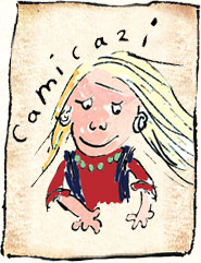
Original drawing by Cressida Cowell, excepted from her book series
Camicazi is the heir of another tribe in the books (the Bog-Burglars), and is one of Hiccup's best friends. She is described as a tough, headstrong girl, extremely capable as a thief and swordfighter but somewhat overconfident. Like Hiccup, she is the smallest in her tribe (that also consists of large, stocky vikings). Though she has a general disdain for men, she seems to have complete faith in Hiccup and is one of the few people who do not underestimate him.

Unfortunately, Camicazi did not make the cut for the film, as she was retconned in favor of a new character (in the form of Astrid who is cool but comparatively very, very vanilla to Camicazi), and while this worked out fine in the most part, I do feel that Dreamworks might have missed out on a character with a very vibrant personality.

Fortunately for me, I am a big fan of characters with a lot of spunk, so when the idea of designing her into the look of the movie popped into my head, I couldn't help but leap in on it.

The overall challenges of this project were to:
1- Capture her spirit of haughtiness in my drawings
2- Style her to be on model with the production style developed by Nico Marlet and Simon Otto
3- Visually fit her into the movie without making her seem out of place


The first two images are a collection of early exploratory sketches. The overall outfit didn't go through much change, especially since the movie already set a pretty clear framework as to how the "fashion" of the movie worked. I noticed that Cressida's drawings of Camicazi often featured a sort of sash that she wore across her chest and torso (much in the similar fashion as a messenger bag strap). I felt that a sash would feel extremely out of place in the setting of the feel but I wanted to keep a similar shape in, so I gave her a satchel with a similar shape. Afterall, where else would she keep all of her stolen underwear?


 An observation I made from doing shape silhouette studies of the teen character lineup in the film was the fact that all of the characters sans Hiccup and Astrid wore viking helmets that clearly differentiated the forms on their heads. The helmetless fashion of Hiccup and Astrid set them apart, and I felt that this was an appropriate design decision for Camicazi as well.

Defining a clear silhouette for Cami to distinguish her from Astrid and Ruffnut was especially important, and I figured the best way to go about this would be with her hair, as it is already a prominent feature in Cressida's original drawings. However, one of the crits I got from my professor early on was the fact that her hair shape was too clean, giving her a sort of "trolls" kind of look that made her really ugly. To avoid this, I ended up looking at examples of viking braids and the approach Pixar took on Merida's hair in Brave so I could break up the silhouette.


This is an expression sheet that I did to feel out the character's personality once she had a more on-model look. I ended up referencing the expression on the top left in the final composite.


Here is the final design of the character in a front-side-back turnaround format. After deliberating with some peers and my professors, I decided to remove the pearl necklace she had in favor of a dragon teeth necklace; pearls as a material do not show up in the film at all (and would definitely feel out of place in the final setting of the film), and rendering the reflections of the pearls would have given me more trouble than it is worth. It is a bit of a compromise, but one that I feel works better for the overall goal of the project.


A prop sheet with some belt emblem ideation. Explanations are on the page.


Texture call out for my own (and a potential modeler's) reference. How To Train Your Dragon is an EXTREMELY textural film. Because my turn-around is not rendered out to a hyperrealistic degree, I felt a texture call-out sheet was necessary as reference so I know what kind of material to render certain areas of her outfit in the final painting process.


The shot that I chose to composite her into. I felt like this would be a fun shot to choose in context, as as during this scene Hiccup is saying "Pain. Love it!" after all the other teens are talking on how they want to get injuries from dragon training. Also, that face is pretty funny.

And the final composite!

Friday, October 17, 2014

.Emote(); Character Designs and Fifth Element Environment

No update on the comic yet, unfortunately, since the deadline (fortunately) has been moved to next week (thank goodness since my schedule has been pretty crazy lately). In the meantime, I'll post a couple of things I have been working on.


Character designs for the Nathan Fox DLP. Digital avatars and robots! Lots of fun figuring this one out.


Development drawings and reference sheet for my Fifth Element environment design for Tom Esmeralda's visual development class at San Jose State University. I wanted to design a look for a potential Chinese reboot of the film. An observation that I noted in many urban cities that are heavily populated by people of Asian descent is the abundance of billboards and street signs attached to buildings in crowded settings, so I designed my environment around that sort of feeling.

And here is the illustration as submitted for a final turn in for the class:


All in all I am very happy with how it came out. I got a very good crit and a very informative paint-over on what to do when I continue to embellish this piece. It's easy to say that this is the best piece I've done as of yet, and I feel that my confidence in perspective and painting has grown a lot throughout the duration of this piece. Nonetheless I will continue to refine this piece so I can have this as a central portfolio piece when I head to CTNX this year.

Saturday, October 4, 2014

[PREVIEW] .Emote();


Cover and first page for a short comic I’ve been working on for the past month or so for Nathan Fox’s distance learning program at SJSU. There are some revisions I need to make, but I will have the full comic posted up when the revisions are complete!

For all of my fellow Shrunkenheadmen who soldiered through the same ordeal and made it through the end despite the extra work, we did it! Now let’s follow through with the revisions for an awesome publication of our works!

Fire it up!

Saturday, September 27, 2014

115- The First Hunt Model Sheets

More work from last semester. This was for a personal film I made in an animation class that I titled "The First Hunt."

Here are the model sheets:


Friday, September 26, 2014

117A- Gary Soto Project

Hey all!

Figured I'd post up my work from last semester in my first visual development class. Our assignment was to illustrate a story moment that could possibly be featured in a coming of age film inspired by the writings of Gary Soto.

We'll start off with some early development drawings. As I was reading through Soto's stories, I noticed that despite the overall happy tones of his stories, the struggles of the times of then were definitely apparent; his family was overworked and his stepfather was developing alcoholism due to being overworked and underpaid. I wanted to capture a moment of loneliness and betrayal that could have been caused by such a situation; the drawing on the very right of the first page captured the spirit of what I wanted the final piece to be.


For the isometric, I ended up constructing the entire scene in Maya. This was extremely helpful as it allowed me to worry less about constructing my own perspective and allowed me to figure out different layout views a lot faster.


Final line layout:


Value and color development. My professor showed our class some really good techniques on how to design the values in our scenes to make them read clearly.

Final lighting comp.


The final illustration.


Thursday, April 17, 2014


Figure drawings from a session at SJSU. This particular model frequents Dreamworks Studio, so we got a healthy dose of stories from her. As I was drawing her, I couldn't help but notice something particularly alive about this woman.

Later on in the session, she told us about a story of a model who had to come to terms with her overweight issues and how the story of that model influenced her as well. I have to say, she really changed my perception of what is beauty; she herself has to be one of the most beautiful persons I have ever met.

Tuesday, April 15, 2014

Digital Painting Studies

Here is a collection of digital painting studies that I have done throughout the course of this semester. The first three are photo studies done in my illustration class as a means to warm up to painting in photoshop. The rest are quick studies I've done in my spare time.


Still Life Object (original photo here)


Monument Valley

Rockerfeller Center


 Speedpaint screencap studies from Martin Scorsese's Hugo (2011).


Speedpaint screencap studies from Carl Reed's The Third Man (1949).


Anna Lee Fisher, the first mother in space. I believe this is from a 1985 issue of Time. Original photo here.

Thursday, March 6, 2014

115- Background Studies


Today shall be known as the day I learned to paint really fast, lol. Jesus my main hand hurts in the joints.

These are various background studies of particular animated films, specifically those that feature forest type backgrounds for the most part (save a few that I did for fun). This study is meant as sort of reference material for the short I will be working on in my second animation class.

The individual studies are pretty small in size, but the sheer number and my own time constraint challenged me to paint faster with bigger, looser strokes. I feel a bit burnt out from this, but I think I've actually learned a lot from doing this haha.